iOS, Android •
Dave has given me the impression that HexWar are the Lucy van Pelt to our Charlie Brown, repeatedly advertising wonderful games and delivering troubled ones once we get our hopes up. I assume that, once the running gag had been established, the challenge for Charles Schultz was to find a way to create interest in a joke with a predictable ending. With Lightning: D-Day, HexWar did it by translating to app from a well-regarded, unusually simple WWII card game famous for its poorly-written rules. I had hoped that the combination of a lower degree of difficulty than their ambitious past games mixed with an easily addressed problem in the cardboard version made this a superb candidate for an unqualified HexWar success. Then again, we all know how this joke ends.
Lightning: D-Day has fairly simple rules, comparable to The Battle for Hill 218, but it puts a bit more complexity onto its cards. Over five rounds, you’ll activate units deployed to each lane (that is, beach) and fight with active forces bolstered by cards from your hand. Within each round, you have a substantial element of hand management in which your ideal will often be to find an inessential fight in which to lure your opponent into overcommitting to a Pyrrhic victory, thus stripping their hand of useful cards. Each round has different rules, which start off slowing down the Allies before escalating to a powerful final assault. The game is scored according to the number of beaches which still have Axis forces present at the end of the fifth round–you don’t simply win or lose, you can win decisively, marginally, or historically.

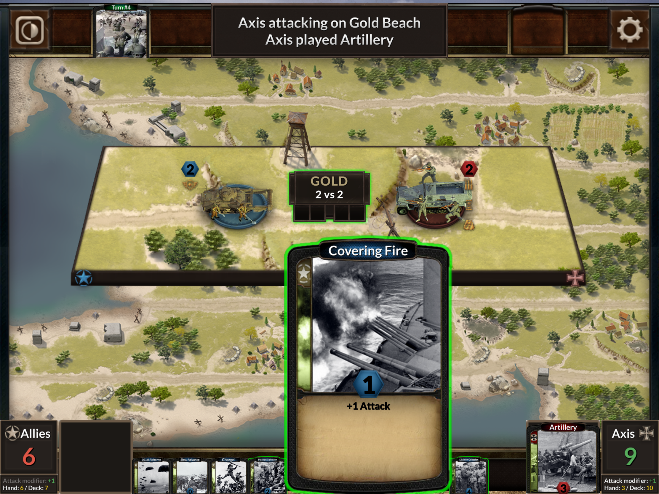
Unfortunately, rather than addressing the problems with the physical version, it exacerbates them into a carnival of usability blunders. Consider the pictured “Covering Fire” card, which has a “1” in a blue circle and a “+1 Attack” in the text box. It’s tempting to see this as explanatory text which simply explains what the card does, but what this actually means is that you can play the card for +1 on defense or for +2 on attack. That’s confusing if you first encounter cards like “Stragglers”, which also have a number and explanatory text, but they aren’t additive. That wouldn’t be awful if all of this were explained in the rules, perhaps with some examples, but I wouldn’t have started this sentence that way if they were. So the card game is pretty simple, but presented with confusing interface choices which are never explained.
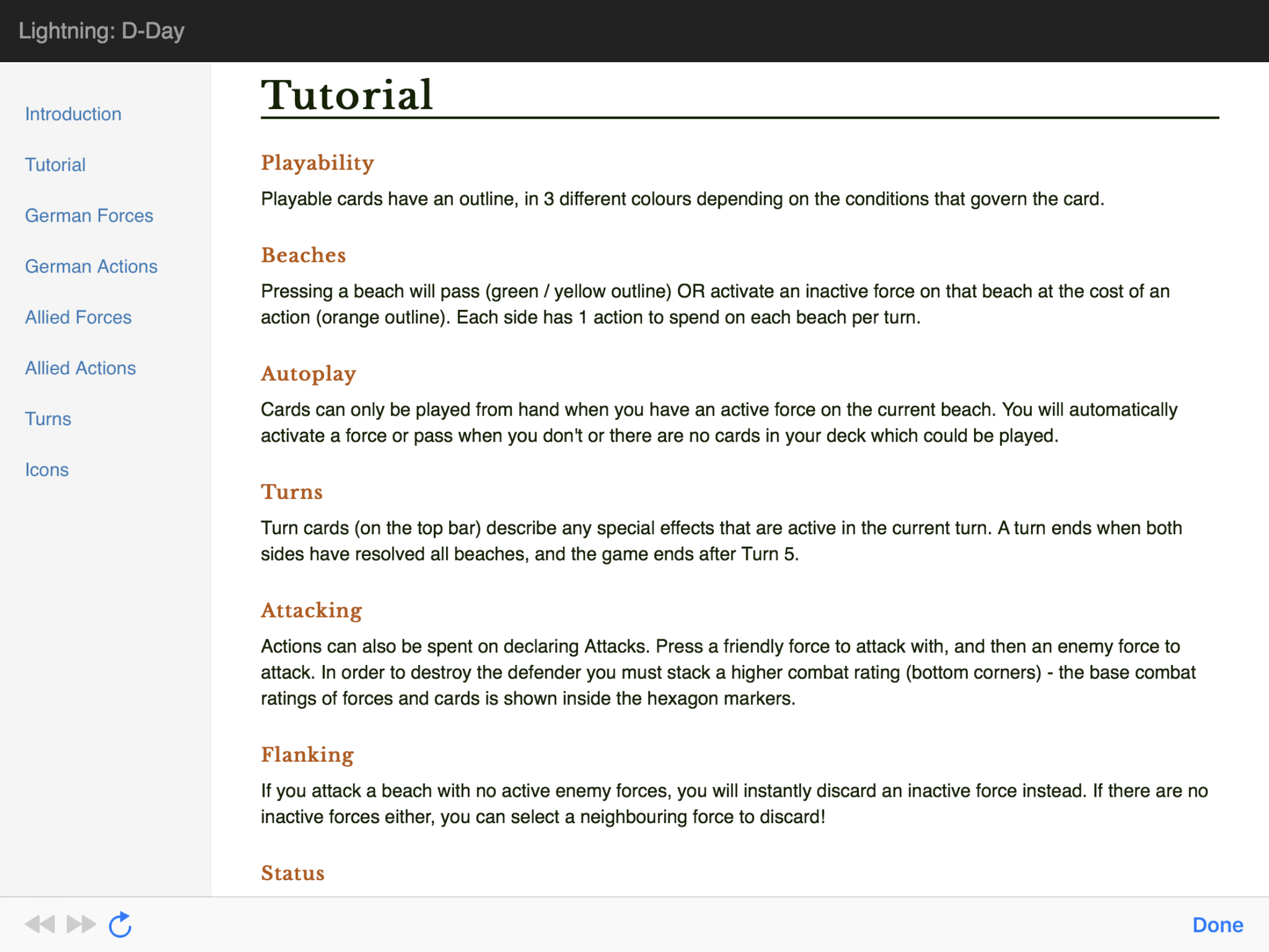
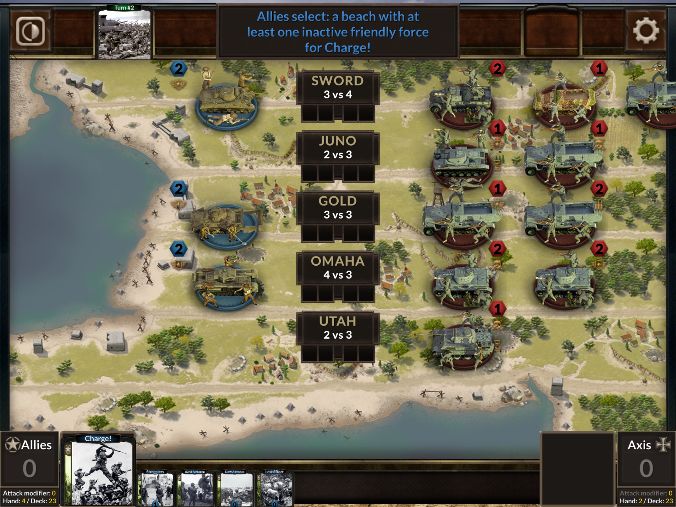
I normally appreciate developers treating tabletop adaptations with a degree of respect, but I could have done without replicating this pattern in the app. Some choices are just daft–if you have three units in a lane, you have no way to see the third unit’s strength on the iPad, because the lane extends beyond the bounds of the screen (the phone’s aspect ratio doesn’t suffer this problem). Others are usable, but awkward and unexplained in the dramatically underspecified “tutorial”. The way inactive forces are displayed was confusing to me for quite some time, and the game often waits for your confirmation without explaining why or what your options are. My favorite example, I think, is the bizarre button economy the game has going on. I get thrift. I don’t think I’m terrible about it, but I admit that I save the disposable spoons from the frozen yogurt place down the street. But Lightning: D-Day frequently asks players to tap a beach to confirm something utterly unrelated to the beach (for example, that you’ve selected all the cards you wish to discard). Prioritizing saving virtual buttons over clarifying user confusion feels like my son saying we have to walk to the library to get the Pokemon GO PokeStop so he can get more Poké Balls to waste on failing to catch some random Pokémon that isn’t even there. I spent more time than I care to admit looking up capitalization and diacritical marks for that last sentence.

Once you get used to the way the interface works, it does work, and the game it presents has some promise. Unfortunately, by that point, you’re likely to be sufficiently versed in the game that the AI no longer offers much challenge, and the unreliability and emptiness of the multiplayer lobby will mock your desire for a human opponent. I’m also not sure whether the flow of the games I’ve played is down to quirks in the AI or a genuine problem with the game, but, very frequently, rather than a judicious contest in which both players play cards reluctantly, searching for just the right moment, the AI or I play all relevant cards at the first opportunity. This saps the game of nearly all its decision-making and leaves results dependent on the luck of the draw entirely too often.
Lightning: D-Day isn’t so much a terrible game as a wasted opportunity for a much better one. Units are presented as attractive three-dimensional models with special abilities you can’t see until you tap each one. There’s no undo feature, even in the many cases in which one would be useful and wouldn’t reveal any hidden information. Taken as a whole, it communicates disdain for the comfort of its players. If you don’t mind an interface which expects you to conform to its needs rather than the reverse, this is a pleasant enough diversion with enough thematic elements to evoke the most famous amphibious assault in world history in a quick-playing, rules-light package. But there’s too much about it which works unintuitively or not at all for me to recommend it to most readers.


It sounds like Hexwar is doing their best to win the Worst Developer of the Decade trophy… everything they churn out is a disaster, not to mention the multiplayer wasteland that plagues their lobbies…
Good review of what sounds like a bad port!
I absolutely give them credit for choosing well in what they decide to make. The plans for their games sound superb, and that matters. When they put out a marvelous-sounding press release, all that stuff is generally present. I just disagree with their usability doctrine (and the multiplayer woes are sad).
Ah, Hexwar. That special blend of polished yet broken without being actually buggy, giving you almost what you want and yet … not. I’d know the scent of those pixels anywhere.
Mayhaps this is the issue I have with them? Everything they plan sounds great, and then they only deliver halfway. They promise two day express UPS and then end up sending it by Lasership… to the wrong address.